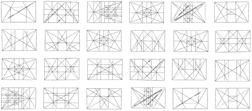
When I was in design school, in a history of art class, we analyzed the structure of some baroque masterpieces. I was amazed to find out that there was a rational base behind everything that helped the artist compose the elements on the canvas, keeping proportions, ratios, rhythm, and directions. A silent geometry is always working in the background.
Las Meninas by Diego Velazquez.
In one way or another, compositional structures have always been present in the art and design world. One of their well-known forms used in modern media is grids, the foundation of layout design.
Columns, baseline grids, and modular grids, they are the invisible force behind all the elements, organizing, keeping the cohesive relation between each other and the layout itself.
Still, grids have served the purpose of conceiving the design. We started using them in digital layouts like websites, applications, and software for different platforms and devices. They were limited to the designer software. They needed to be translated to the engineers with spaces, paddings, and margin specifications.
Stateside website layout design.
That translation always created this gap between design and implementation. The coded output of a designed layout was never pixel-perfect or was hard to recreate with veracity. In some ways, the problem lies in how layouts are built on design and code and how their foundations differ.
It is important to note that digital layouts have become more complex. They aren’t static anymore. Like in print media, today they need to adapt to different viewport sizes. We don’t know if the content will be viewed on a mobile device or a smart TV. We simply don’t have that control anymore.
Another factor is that more people are involved in creating digital media, UX designers, art directors, UI designers, back-end and front-end developers, iOS and Android engineers, and the list goes on.
If we want to be efficient and create unforgettable experiences, we all need to talk in the same language. We need to build our layouts in the same way, with the same design foundations.
Nowadays, most browsers have implemented the CSS grid property. It has become a standard in layout design for websites. CSS grids are closing the gap I mentioned before because designers can create their grids, and they can be exactly replicated with code using a simple CSS property. This makes the design foundation the same for everybody.
Designers create layout snapshots of specific viewport sizes. They set the layout rules with the grids and the developers can better interpret and understand those rules and implement them in their thoughts. Nothing is lost in translation, and it is simpler to decipher the layout rules for a developer by just seeing how the elements are sitting on the grid. This has become even more crucial in these responsive design times, where absolute measurements don’t exist anymore.
With that mindset, we stop saying that a component measures 600px width on a desktop and will be 320px. That always left so many questions to the developers. How does the component behave between those widths? What are the spacing rules?
It is easier to understand that a component width is eight columns on a desktop and that it will change to 12 columns on mobile devices. That better explains the whole context and how the component is related to the layout. You can also establish that the gutter on a desktop is 30px. On a mobile device that would change to 15px. The grid sets the global spacing rules and the behavior of the layout and all the elements are just sitting on this structure. It can be easily changed and adjusted if needed.
Finally, designers and engineers can speak the same language and build layouts with the same design principles. I think this will get us closer in the way we build, and we can aim for a more efficient way to work with the output for better-made and designed layouts. We have nothing to lose. Stateside can see this future of better, more integrated design where all elements are working together with peak efficiency. That’s why we’ve worked hard to put together a team of designers, engineers, and programmers with the skills to take your web layout and design to a level that sets you ahead of the competition.
You have the dream, we’ll build the team that can make it happen. Contact Stateside today.


